Google+ New Layout Overview April 2012
My first impressions new Google+ Layout
Considering Google+ is only months old… a makeover seems a bit premature… but change is as good as a holiday, I suppose.
At first view it seems like a mirror image of the old layout and feels a little disjointed.
Google+ Menu Buttons
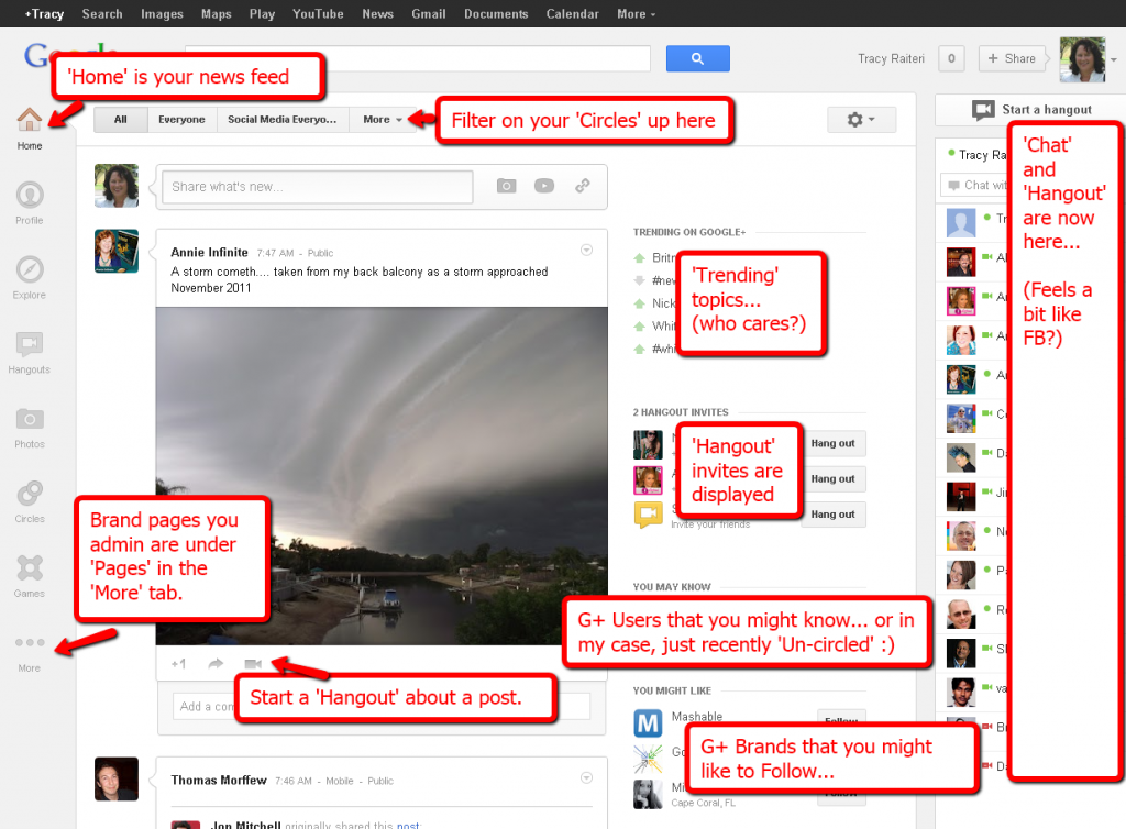
The layout now has a column of menus buttons down the left side. The ‘Home’ is your news feed; ‘Pages’ are the brand pages you admin; and the ‘More’ button displays the Menu items that aren’t being displayed.
Google+ Home Screen
Google+ Profile Screen
The Profile has changed. Your profile image is now on the right side and your out-bound links on the “About” are now all the way down the bottom of your profile (Probably G+ trying to limit users clicking on links that take the user away from G+).
Google+ Explore Screen
There is a menu button called ‘Explore’ which appears to show popular posts on G+. might be handy if you’re one to follow the crowd.
Potential Spot for Google+ Adverts
There is valuable screen real estate not being used to its full potential, so I am suspecting that this is where Google will place their ‘G+’ adverts.
Anyways, off to play with the new Google+ Layout. Would love to hear your views… post them in the comments below… and don’t forget to “+1″ this post… thanks.

Leave a Reply